
Simplifying Sign-up for Checkout @ affirm
Simplifying Sign-up for Checkout @ affirm
Estimated 5 min read
Estimated 5 min read
How did I create impact?
How did I create impact?
I simplified the sign-up flow resulting in:
+$84M in GMV
+3.2% in checkout completion
+2.3% in authentication
I simplified the sign-up flow resulting in:
+$84M in GMV
+3.2% in checkout completion
+2.3% in authentication
What makes this case study unique?
What makes this case study unique?
I led this large design initiative across 3 teams (Trust & safety, Purchasing, & Upfunnel) to increase authentication & checkout rates, partnering closely with security & legal teams to ensure compliance
I led this large design initiative across 3 teams (Trust & safety, Purchasing, & Upfunnel) to increase authentication & checkout rates, partnering closely with security & legal teams to ensure compliance
Declining sign-up rate @ online checkout
Declining sign-up rate @ online checkout
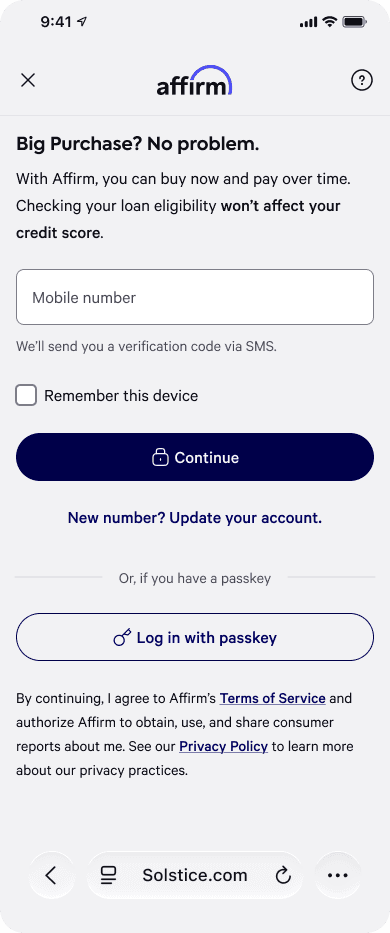
When a new customer chooses Affirm to pay for an online purchase, the first thing they see is this phone number entry page.
It's step #1 of the sign-up flow, and we were seeing steep drop in users making it through the flow, especially on our fastest-growing channels: Shein, Temu, and TikTok. Yikes!
When a new customer chooses Affirm to pay for an online purchase, the first thing they see is this phone number entry page.
It's step #1 of the sign-up flow, and we were seeing steep drop in users making it through the flow, especially on our fastest-growing channels: Shein, Temu, and TikTok. Yikes!

& the final shipped solution wasn't the one anyone bet on…
& the final shipped solution wasn't the one anyone bet on…
Prior research pointed at TWO possible culprits
Prior research pointed at TWO possible culprits

Earlier research specific to Shein, Temu, & Tiktok had flagged two suspects: credit-check anxiety (people not wanting a soft credit check for a small purchase) and plain indecision (people not ready to commit, phone number or not).
Earlier research specific to Shein, Temu, & Tiktok had flagged two suspects: credit-check anxiety (people not wanting a soft credit check for a small purchase) and plain indecision (people not ready to commit, phone number or not).
Complexities of working across 3 teams
Complexities of working across 3 teams
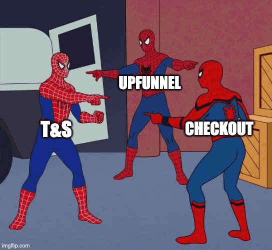
The biggest challenge in leading this initiative across Trust & Safety, Checkout, & Upfunnel team was understanding each domain's nuances and ALIGNING past, current experiments.
The biggest challenge in leading this initiative across Trust & Safety, Checkout, & Upfunnel team was understanding each domain's nuances and ALIGNING past, current experiments.
Our bets & preliminary research findings
Our bets & preliminary research findings
1) Card sorting
1) Card sorting
To clarify users' priorities and the key questions they face in asset management
To clarify users' priorities and the key questions they face in asset management

2) Usability Testing
2) Usability Testing
Going through the Hackathon Prototype to gather feedback and refine its value.
Going through the Hackathon Prototype to gather feedback and refine its value.

N
N

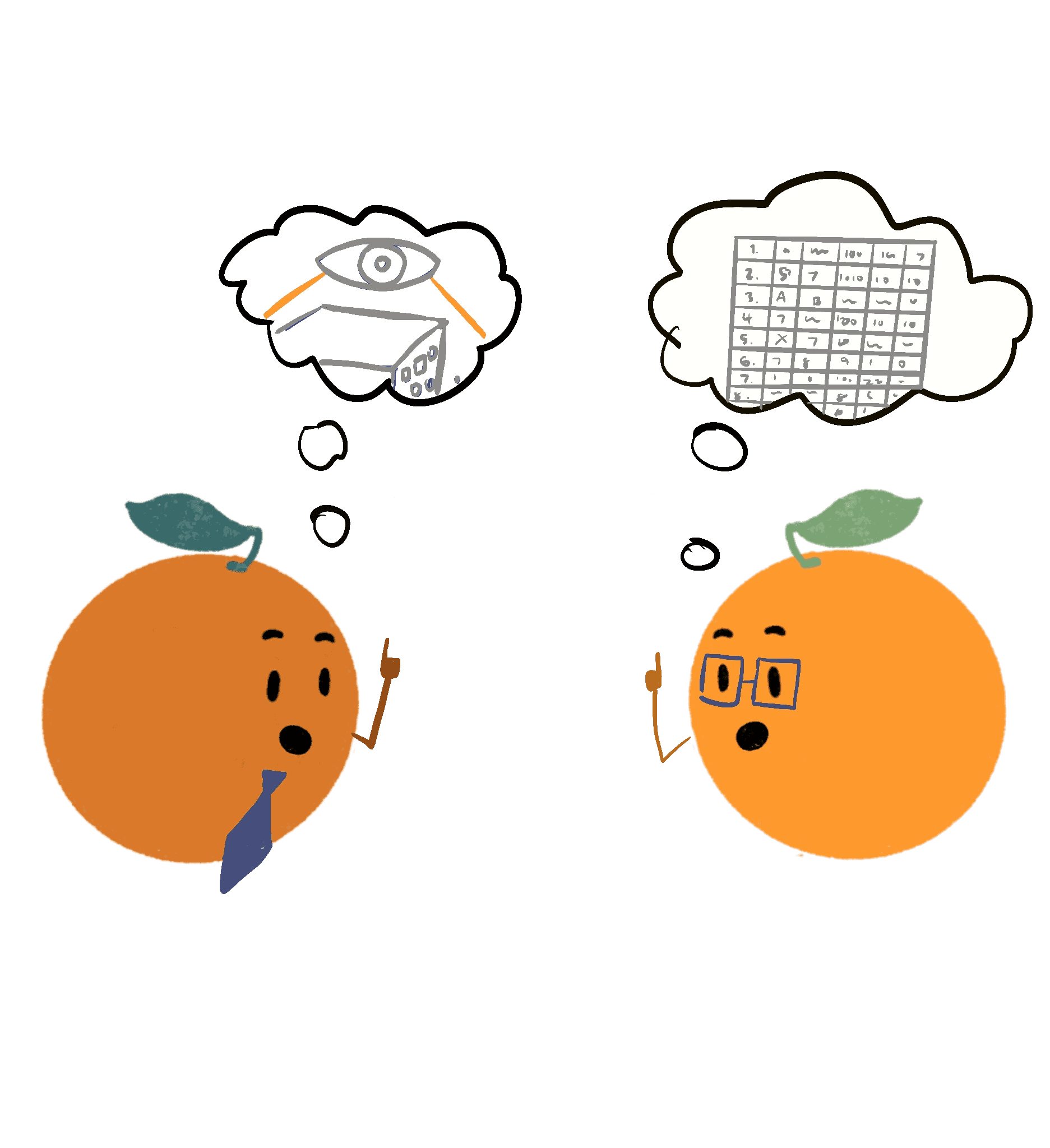
1) Different users require different levels of understanding on a project.
Some users want a Birds Eye view of a large project, while other users need a granular understanding of tasks. The current platform doesn’t support both sets of users.
1) Different users require different levels of understanding on a project.
Some users want a Birds Eye view of a large project, while other users need a granular understanding of tasks. The current platform doesn’t support both sets of users.
2) Users have a different understanding of what colors mean, compared to how Autodesk uses colors throughout the platform, leading to confusion and misunderstanding.
2) Users have a different understanding of what colors mean, compared to how Autodesk uses colors throughout the platform, leading to confusion and misunderstanding.


3) Flagging issues is critical to prevent project delays. Users lack a scalable overview of project issues and must check assets individually, slowing down progress.
3) Flagging issues is critical to prevent project delays. Users lack a scalable overview of project issues and must check assets individually, slowing down progress.
4) Accessibility concerns; In the existing design, the black text on dark blue is illegible. We need to find a way to show both the percentage and corresponding shade of blue.
4) Accessibility concerns; In the existing design, the black text on dark blue is illegible. We need to find a way to show both the percentage and corresponding shade of blue.

Cross-functional brainstorming
Cross-functional brainstorming
After synthesizing the research, I presented the insights to the team and led a cross-functional brainstorming session with the PMs and Engineers to collect ideas on possible solutions.
Here are the concepts we brainstormed, focusing on varying levels of information granularity and multiple approaches to visualizing statistics.
After synthesizing the research, I presented the insights to the team and led a cross-functional brainstorming session with the PMs and Engineers to collect ideas on possible solutions.
Here are the concepts we brainstormed, focusing on varying levels of information granularity and multiple approaches to visualizing statistics.

Single Percentage
Overall Progress by Project
Project Issue Count
Overall Progress by status
Timeline by status
Progress View
Stacked Bar Chart
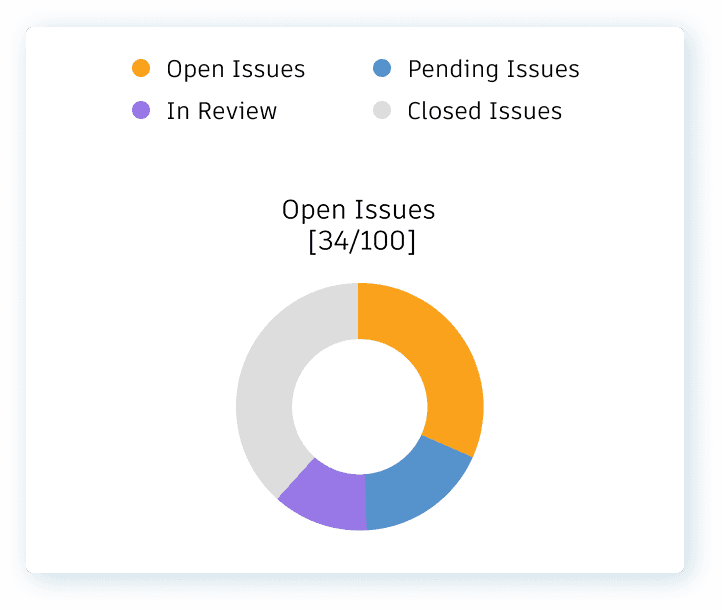
Donut Pie Chart
Active View
Donut Pie Chart





Issue Count Tableview


Research Part II: Matching User Needs
Research Part II: Matching User Needs
To better understand what type of information visualization best matches user needs, we conducted research through card sorting with the same 5 customers and 3 internal domain experts.
We found that users preferred the following data highlighted to help them make critical decisions.
For granular information:
1) Active issues per individual asset
For overall project progress:
1) Real Time Asset Progress
2) Asset Progress over time
To better understand what type of information visualization best matches user needs, we conducted research through card sorting with the same 5 customers and 3 internal domain experts.
We found that users preferred the following data highlighted to help them make critical decisions.
For granular information:
1) Active issues per individual asset
For overall project progress:
1) Real Time Asset Progress
2) Asset Progress over time
Granular Information Design Iterations
Granular Information Design Iterations
To match user's needs for granular information as highlighted by research this is what I came up with.
To match user's needs for granular information as highlighted by research this is what I came up with.

In the existing design, users were able to see their assets in a table, but didn't have insight on areas holding up project process. I proposed to add the active issues and active forms columns. This helps users flag down areas holding up project progress,
Additionally, I designed a popover that appears upon hover that directs users to the specific issue when clicked on.
In the existing design, users were able to see their assets in a table, but didn't have insight on areas holding up project process. I proposed to add the active issues and active forms columns. This helps users flag down areas holding up project progress,
Additionally, I designed a popover that appears upon hover that directs users to the specific issue when clicked on.
Overall Project Progress Design Explorations
Overall Project Progress Design Explorations
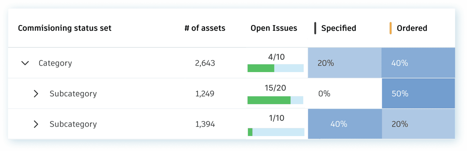
The existing design showed both 1) Real Time Asset Progress and 2) Asset Progress over time, but the designs weren't accessible —the visualization colours the entire cell with a hue of blue that corresponds to the percentage of completion.
The existing design showed both 1) Real Time Asset Progress and 2) Asset Progress over time, but the designs weren't accessible —the visualization colours the entire cell with a hue of blue that corresponds to the percentage of completion.

✅ Pros: Colour is very telling of the state of progress
❌ Cons: Not accessible, black text on a dark blue background fails WCAG miserably. In fact, any cell with a percentage higher than 35% is illegible.
✅ Pros: Colour is very telling of the state of progress
❌ Cons: Not accessible, black text on a dark blue background fails WCAG miserably. In fact, any cell with a percentage higher than 35% is illegible.
I needed to explore alternative ways to visualize the data. Here's a snapshot of some of my explorations.
Option 1: Outlining/highlighting numerical value
I needed to explore alternative ways to visualize the data. Here's a snapshot of some of my explorations.
Option 1: Outlining/highlighting numerical value

✅ Pros: Easier to read the percentage
❌ Cons: Doesn't align with current design system & contrast is distracting
✅ Pros: Easier to read the percentage
❌ Cons: Doesn't align with current design system & contrast is distracting
Option 2: Matching colours in circles to the status colour

✅ Pros: Easier to read the percentage
❌ Cons: Difficult to interpret meaning from variety of different colours
✅ Pros: Easier to read the percentage
❌ Cons: Difficult to interpret meaning from variety of different colours
Option 3: Containing shades of blue to circles.

✅ Pros:
1) Easy to read the percentage
2) Easier to interpret meaning from shade of blue
3) Aligns with Design system.
❌ Cons: Different shades of blue are harder to differentiate given the smaller size of circles, however overall project progress is still communicated.
✅ Pros:
1) Easy to read the percentage
2) Easier to interpret meaning from shade of blue
3) Aligns with Design system.
❌ Cons: Different shades of blue are harder to differentiate given the smaller size of circles, however overall project progress is still communicated.
Final Designs
Final Designs


Learnings and Reflections
Learnings and Reflections
Cross-functional alignment accelerates impact
Engaging with PMs and engineers early through collaborative workshops ensured design decisions were user-centered, technically feasible, and aligned with business goals.Research is only as valuable as its execution
Card sorting and usability testing provided insights, but their real impact came when deciding which data visualization best served users. By prioritizing the most intuitive option, we made a research-driven decision that aligned with user needs and improved clarity.Designing for today while planning for tomorrow
Beyond the MVP, I developed a future-proofed concept to ensure scalability over the next five years, giving the team a clear roadmap for growth and iteration.
Cross-functional alignment accelerates impact
Engaging with PMs and engineers early through collaborative workshops ensured design decisions were user-centered, technically feasible, and aligned with business goals.Research is only as valuable as its execution
Card sorting and usability testing provided insights, but their real impact came when deciding which data visualization best served users. By prioritizing the most intuitive option, we made a research-driven decision that aligned with user needs and improved clarity.Designing for today while planning for tomorrow
Beyond the MVP, I developed a future-proofed concept to ensure scalability over the next five years, giving the team a clear roadmap for growth and iteration.

That’s one win—let’s check out another!
That’s one win—let’s check out another!

Championing Mental Health @ Talk it out
Breaking down barriers & increasing accessibility to mental health support for 42,000 students

Turning Crisis into Confidence @ 1Password
Empowering families during emergencies using Legacy Access, placed #1 in Hackathon
Turning Crisis into Confidence @1Password
Turning Crisis into Confidence @1Password
Empowering families during emergencies using Legacy Access, placed #1 in Hackathon and
Empowering families during emergencies using Legacy Access, placed #1 in Hackathon and
Championing Mental Health @ Talk it out
Breaking down barriers & increasing accessibility to mental health support for 42,000 students